9. Visualization: Seaborn#
9.1. Quantities:#
This type of graph shows the levels of variables. Also, these graphs show the variables according to categories or classifications.
import numpy as np
import pandas as pd
from pandas import Series, DataFrame
import matplotlib.pyplot as plt
import seaborn as sns
import datetime as dt
The following database includes enaho modules (200, 300 and 500) for the period 2011 - 20119#
enaho = pd.read_stata(r"../_data/enaho.dta")
enaho
| year | conglome | vivienda | hogar | ubigeo | codperso | dominio | estrato | panel | p203 | ... | acumulado | estud | educa | d_edu | exper | exper_2 | tenure_2 | edad_2 | jefe | ubigeo_2 | |
|---|---|---|---|---|---|---|---|---|---|---|---|---|---|---|---|---|---|---|---|---|---|
| 0 | 2011 | 0061 | 077 | 11 | 010701 | 04 | selva | de 4,001 a 10,000 viviendas | 2.011006e+14 | hijo/hija | ... | 6.0 | 5.0 | 11.0 | Secundaria completa | 2.0 | 4.0 | NaN | 361.0 | familiar | 010000 |
| 1 | 2011 | 0110 | 112 | 11 | 010705 | 05 | selva | Área de empadronamiento rural - aer compuesto | 2.011011e+14 | hijo/hija | ... | 6.0 | 5.0 | 11.0 | Secundaria completa | 3.0 | 9.0 | 9.0 | 400.0 | familiar | 010000 |
| 2 | 2011 | 0090 | 076 | 11 | 010205 | 03 | selva | Área de empadronamiento rural - aer compuesto | 2.011009e+14 | nieto | ... | 6.0 | 5.0 | 11.0 | Secundaria completa | 5.0 | 25.0 | 36.0 | 484.0 | familiar | 010000 |
| 3 | 2011 | 0118 | 080 | 11 | 010401 | 03 | selva | Área de empadronamiento rural - aer simple | 2.011012e+14 | hijo/hija | ... | 6.0 | 5.0 | 11.0 | Secundaria completa | 6.0 | 36.0 | NaN | 529.0 | familiar | 010000 |
| 4 | 2011 | 3408 | 066 | 11 | 010402 | 03 | selva | Área de empadronamiento rural - aer compuesto | 2.011341e+14 | hijo/hija | ... | 6.0 | 5.0 | 11.0 | Secundaria completa | 3.0 | 9.0 | 0.0 | 400.0 | familiar | 010000 |
| ... | ... | ... | ... | ... | ... | ... | ... | ... | ... | ... | ... | ... | ... | ... | ... | ... | ... | ... | ... | ... | ... |
| 160767 | 2019 | 009703 | 084 | 11 | 250302 | 05 | selva | 401 a 4,000 viviendas | 2.019010e+16 | yerno/nuera | ... | 11.0 | 4.0 | 15.0 | Universitaria incompleta | 0.0 | 0.0 | NaN | 441.0 | familiar | 250000 |
| 160768 | 2019 | 009675 | 124 | 11 | 250107 | 03 | selva | de 20,001 a 100,000 viviendas | 2.019010e+16 | hijo/hija | ... | 6.0 | 5.0 | 11.0 | Secundaria completa | 5.0 | 25.0 | 0.0 | 484.0 | familiar | 250000 |
| 160769 | 2019 | 009703 | 084 | 11 | 250302 | 04 | selva | 401 a 4,000 viviendas | 2.019010e+16 | hijo/hija | ... | 6.0 | 5.0 | 11.0 | Secundaria completa | 9.0 | 81.0 | 0.0 | 676.0 | familiar | 250000 |
| 160770 | 2019 | 009700 | 143 | 11 | 250301 | 03 | selva | 401 a 4,000 viviendas | 2.019010e+16 | hijo/hija | ... | 6.0 | 5.0 | 11.0 | Secundaria completa | 3.0 | 9.0 | NaN | 400.0 | familiar | 250000 |
| 160771 | 2019 | 009645 | 010 | 11 | 250101 | 02 | selva | de 20,001 a 100,000 viviendas | 2.018010e+16 | hijo/hija | ... | 6.0 | 5.0 | 11.0 | Secundaria completa | 9.0 | 81.0 | 0.0 | 676.0 | familiar | 250000 |
160772 rows × 105 columns
Number of companies classification by number of workers hired#
Microbusinesses < 10 workers ; Small businesses (10-20 workers); Medium businesses (21-100 workers); Big Businesses (>100 workers)
Why do many examples use fig, ax = plt.subplots() in Matplotlib/pyplot/python ?
sns.set( style="darkgrid" )
#figure size
fig, ax = plt.subplots( figsize=(7,4) )
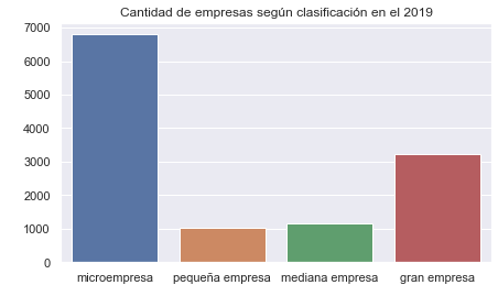
x = sns.countplot( x="empresa", data=enaho[enaho['year'] == "2019" ] )
plt.title('Cantidad de empresas según clasificación en el 2019')
plt.xlabel(' ')
plt.ylabel(' ')
Text(0, 0.5, ' ')
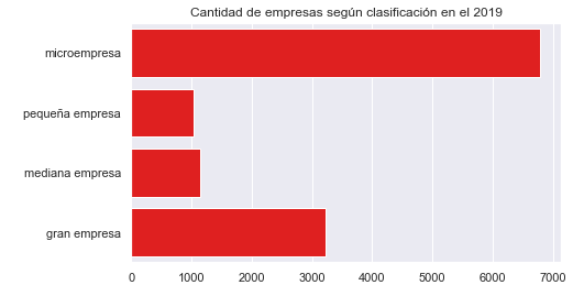
Vertical Countplot and one color (red)#
sns.set(style="darkgrid")
fig, ax = plt.subplots(figsize=(7,4))

x = sns.countplot(y = "empresa", data=enaho[enaho['year'] == "2019" ], color = 'red')

plt.title('Cantidad de empresas según clasificación en el 2019')
plt.xlabel(' ')
plt.ylabel(' ')
Text(0, 0.5, ' ')
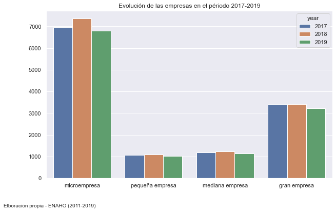
Evolutions of business in period 2017-2019#
base2 = enaho[enaho['year'] > "2016" ]

fig, ax = plt.subplots(figsize=(10,6))

# hue: variable descomposition

ax = sns.countplot(x="empresa", hue="year", linewidth=1, data=base2)
plt.title('Evolución de las empresas en el périodo 2017-2019')
plt.xlabel(' ')
plt.ylabel(' ')
txt="Elboración propia - ENAHO (2011-2019)"
plt.figtext(0.01, 0.01, txt, wrap=True, horizontalalignment='left', va="top", fontsize=10)
Text(0.01, 0.01, 'Elboración propia - ENAHO (2011-2019)')
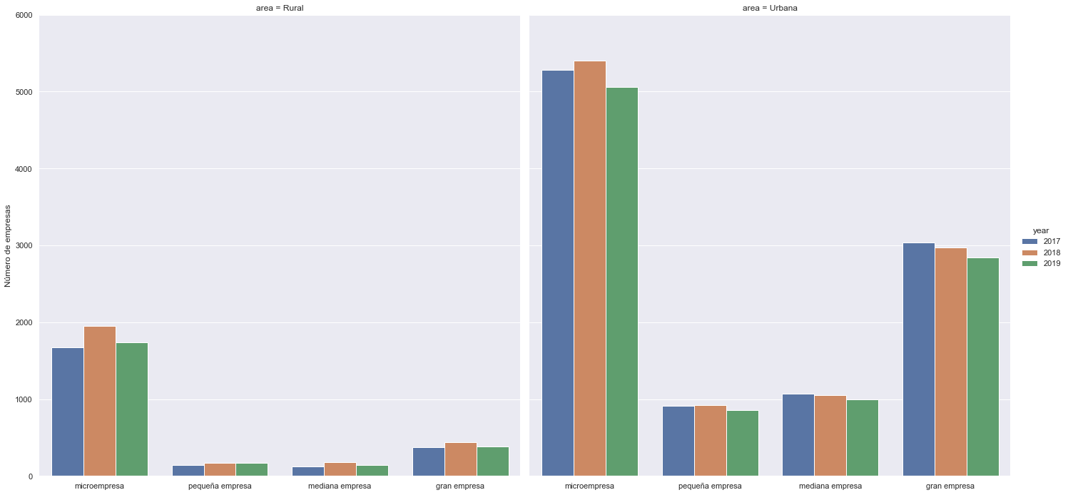
Number of companies by strata (urbano o rural) and evolution by years#
hue = split in groups but in the same graph
col = create two new groups base in id group
ag = sns.catplot(x="empresa", hue="year", col= "area" , data= base2, kind="count", height=10, aspect=1);

(ag.set_axis_labels("", "Número de empresas")
  .set(ylim=(0, 6000))
  .despine(left=True))
<seaborn.axisgrid.FacetGrid at 0x2cbdeb45cd0>
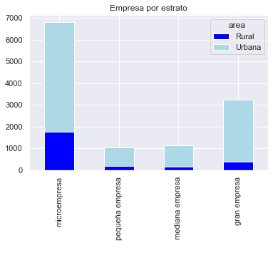
Number of businesses by strata - stacked bar plot#
enaho['conglome']
0           0061
1           0110
2           0090
3           0118
4           3408
           ...
160767    009703
160768    009675
160769    009703
160770    009700
160771    009645
Name: conglome, Length: 160772, dtype: object
enaho[ enaho['year'] == "2019" ].groupby( [ 'empresa', 'area' ] ).size().reset_index(name='num_firms')
| empresa | area | num_firms | |
|---|---|---|---|
| 0 | microempresa | Rural | 1742 |
| 1 | microempresa | Urbana | 5056 |
| 2 | pequeña empresa | Rural | 169 |
| 3 | pequeña empresa | Urbana | 857 |
| 4 | mediana empresa | Rural | 145 |
| 5 | mediana empresa | Urbana | 1000 |
| 6 | gran empresa | Rural | 381 |
| 7 | gran empresa | Urbana | 2846 |
# count businesses by strata using groubpy (similar collapse - stata)
#base_2 = enaho[ enaho['year'] == "2019" ].groupby( [ 'empresa', 'area' ], as_index = False )[['conglome'] ].count()
base_2 = enaho[ enaho['year'] == "2019" ].groupby( [ 'empresa', 'area' ] ).size().reset_index(name='num_firms')
base_2
| empresa | area | num_firms | |
|---|---|---|---|
| 0 | microempresa | Rural | 1742 |
| 1 | microempresa | Urbana | 5056 |
| 2 | pequeña empresa | Rural | 169 |
| 3 | pequeña empresa | Urbana | 857 |
| 4 | mediana empresa | Rural | 145 |
| 5 | mediana empresa | Urbana | 1000 |
| 6 | gran empresa | Rural | 381 |
| 7 | gran empresa | Urbana | 2846 |
# stacked information
base_3 = base_2.pivot(index = 'empresa', columns = 'area', values = 'num_firms')
base_3
| area | Rural | Urbana |
|---|---|---|
| empresa | ||
| microempresa | 1742 | 5056 |
| pequeña empresa | 169 | 857 |
| mediana empresa | 145 | 1000 |
| gran empresa | 381 | 2846 |
base_3.plot( kind='bar', stacked=True, title='Empresa por estrato', color = ['blue', 'lightblue'] )
plt.xlabel(' ')
Text(0.5, 0, ' ')
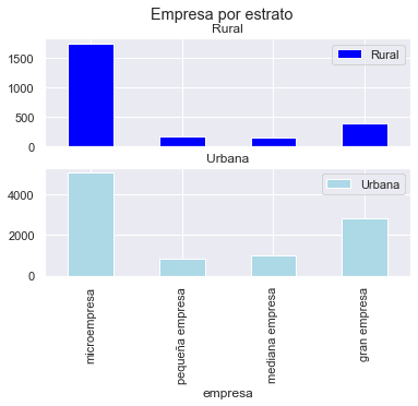
axes = base_3.plot( kind='bar', rot=0, subplots=True, color = ['blue', 'lightblue'], title='Empresa por estrato')
plt.xticks(rotation=90)
(array([0, 1, 2, 3]),
 [Text(0, 0, 'microempresa'),
  Text(1, 0, 'pequeña empresa'),
  Text(2, 0, 'mediana empresa'),
  Text(3, 0, 'gran empresa')])
9.2. Proportions#
Understandable plots to show categorical variables. Use this plots to explain participations from categories.
Pie#
First at all, collapse dataframe to count categories of a variable#
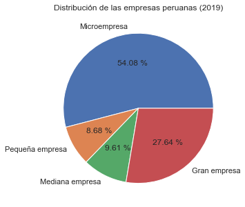
base = enaho.groupby([ 'empresa' ]).count()
base
| year | conglome | vivienda | hogar | ubigeo | codperso | dominio | estrato | panel | p203 | ... | acumulado | estud | educa | d_edu | exper | exper_2 | tenure_2 | edad_2 | jefe | ubigeo_2 | |
|---|---|---|---|---|---|---|---|---|---|---|---|---|---|---|---|---|---|---|---|---|---|
| empresa | |||||||||||||||||||||
| microempresa | 58002 | 58002 | 58002 | 58002 | 58002 | 58002 | 58002 | 58002 | 58002 | 58002 | ... | 57991 | 58002 | 57991 | 57991 | 57565 | 57565 | 58001 | 58002 | 58002 | 58002 |
| pequeña empresa | 9306 | 9306 | 9306 | 9306 | 9306 | 9306 | 9306 | 9306 | 9306 | 9306 | ... | 9301 | 9306 | 9301 | 9301 | 9202 | 9202 | 9303 | 9306 | 9306 | 9306 |
| mediana empresa | 10304 | 10304 | 10304 | 10304 | 10304 | 10304 | 10304 | 10304 | 10304 | 10304 | ... | 10302 | 10304 | 10302 | 10302 | 10212 | 10212 | 10304 | 10304 | 10304 | 10304 |
| gran empresa | 29642 | 29642 | 29642 | 29642 | 29642 | 29642 | 29642 | 29642 | 29642 | 29642 | ... | 29639 | 29642 | 29639 | 29639 | 29392 | 29392 | 29640 | 29642 | 29642 | 29642 |
4 rows × 104 columns
# Labels to correct categories names

labels=['Microempresa','Pequeña empresa' , 'Mediana empresa', 'Gran empresa']

plt.figure(figsize=(5,5))

ax = plt.pie(base['conglome'], labels=labels, autopct='%.2f %%')
plt.title('Distribución de las empresas peruanas (2019)')
plt.show()
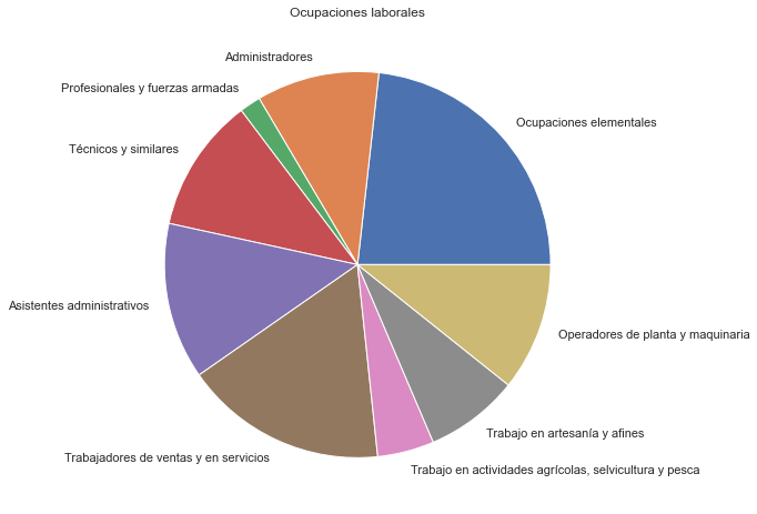
base = enaho.groupby('labor').size()

base.plot(kind='pie', subplots=True, figsize=(8, 8))
plt.title("Ocupaciones laborales")
plt.ylabel("")
plt.show()
Donuts#
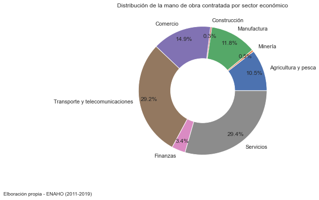
base2 = enaho.groupby([ 'sector' ]).count()

labels=['Agricultura y pesca','Minería','Manufactura','Construcción','Comercio','Transporte y telecomunicaciones', 'Finanzas', 'Servicios']
plt.figure(figsize=(10, 6))

ax = plt.pie(base2['conglome'], labels=labels,
        autopct='%1.1f%%', pctdistance=0.85)

# centroid size and color

center_circle = plt.Circle((0, 0), 0.50, fc='white')
fig = plt.gcf()

fig.gca().add_artist(center_circle)

plt.title('Distribución de la mano de obra contratada por sector económico')

# Adding notes

txt="Elboración propia - ENAHO (2011-2019)"
plt.figtext(0.2, 0.01, txt, wrap=True, horizontalalignment='right', fontsize=10)

plt.show()
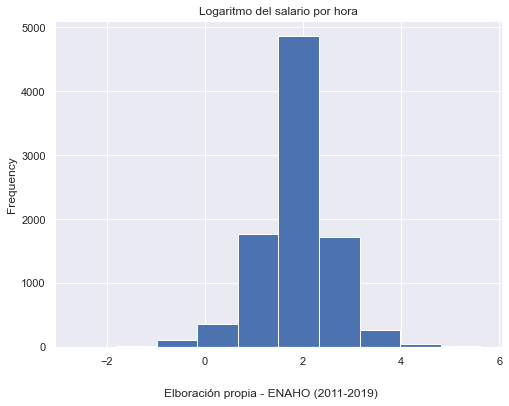
9.3. Distributions#
Distribution plots visually assess the distribution of sample data by comparing the empirical distribution of the data with the theoretical values expected from a specified distribution.
#filter database to 2019
base4 = enaho[enaho['year'] == "2019" ]


base4['l_salario'].plot(kind = 'hist', bins = 10, figsize = (8,6))
plt.title('Logaritmo del salario por hora')

txt="Elboración propia - ENAHO (2011-2019)"
plt.figtext(0.5, 0.01, txt, wrap=True, horizontalalignment='center', fontsize=12)
plt.show()
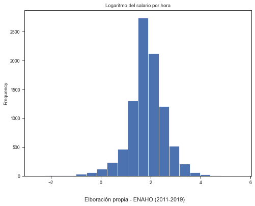
Reducing intervals#
Frequency distribution with a smaller interval (lower relative frequency). Therefore, the height of each bar accounts smaller amount.
sns.set('paper')
sns.set_style("ticks")

base4['l_salario'].plot(kind = 'hist', bins = 20, figsize = (8,6))
plt.title('Logaritmo del salario por hora')

txt="Elboración propia - ENAHO (2011-2019)"
plt.figtext(0.5, 0.01, txt, wrap=True, horizontalalignment='center', fontsize=11)
plt.show()
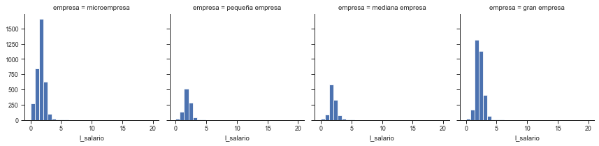
Multiple histograms#
figure1 = sns.FacetGrid(base4, col="empresa", margin_titles=True)
figure1.map(plt.hist, 'l_salario', bins=np.linspace(0, 20, 30));
C:\ProgramData\Anaconda3\lib\site-packages\seaborn\axisgrid.py:703: FutureWarning: iteritems is deprecated and will be removed in a future version. Use .items instead.
  plot_args = [v for k, v in plot_data.iteritems()]
C:\ProgramData\Anaconda3\lib\site-packages\seaborn\axisgrid.py:703: FutureWarning: iteritems is deprecated and will be removed in a future version. Use .items instead.
  plot_args = [v for k, v in plot_data.iteritems()]
C:\ProgramData\Anaconda3\lib\site-packages\seaborn\axisgrid.py:703: FutureWarning: iteritems is deprecated and will be removed in a future version. Use .items instead.
  plot_args = [v for k, v in plot_data.iteritems()]
C:\ProgramData\Anaconda3\lib\site-packages\seaborn\axisgrid.py:703: FutureWarning: iteritems is deprecated and will be removed in a future version. Use .items instead.
  plot_args = [v for k, v in plot_data.iteritems()]
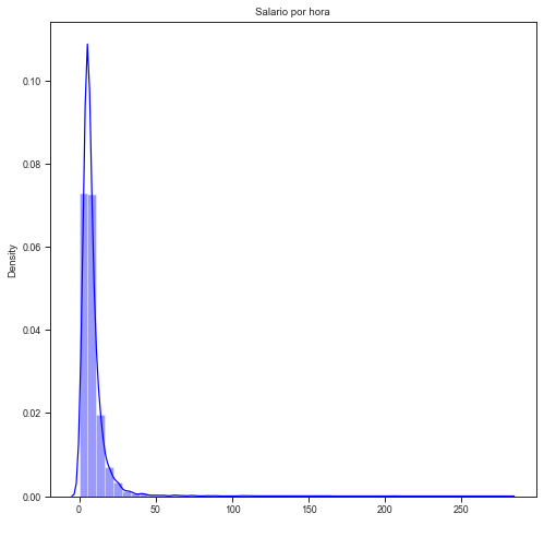
Real salary per hour density:#
the distribution does not resemble a standard normal. The information is concentrated in lower values and there are some observations of high values.
plt.figure(figsize=(8, 8))

sns.distplot(base4['salario'], label = "Densidad", color = 'blue')
plt.title('Salario por hora')
plt.xlabel(' ')
plt.show()
C:\ProgramData\Anaconda3\lib\site-packages\seaborn\distributions.py:2619: FutureWarning: `distplot` is a deprecated function and will be removed in a future version. Please adapt your code to use either `displot` (a figure-level function with similar flexibility) or `histplot` (an axes-level function for histograms).
  warnings.warn(msg, FutureWarning)
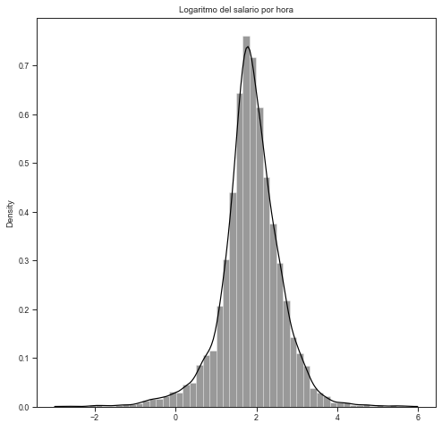
Logarithm of real hourly wage#
This allows correcting the asymmetry presented by the original data.
#Alternative figure size
plt.figure(figsize=(8, 8))

sns.distplot(base4['l_salario'], label = "Densidad", color = 'black')
plt.title('Logaritmo del salario por hora')
plt.xlabel(' ')
plt.show()
C:\ProgramData\Anaconda3\lib\site-packages\seaborn\distributions.py:2619: FutureWarning: `distplot` is a deprecated function and will be removed in a future version. Please adapt your code to use either `displot` (a figure-level function with similar flexibility) or `histplot` (an axes-level function for histograms).
  warnings.warn(msg, FutureWarning)
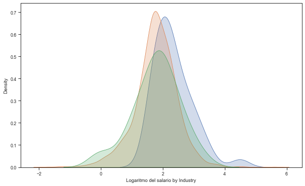
Real salaries for tres sectors (Construction, Mining and services)#
plt.figure(figsize=(10, 6))

#Adding densities

sns.kdeplot(base4.l_salario[base4.sector=='Construcción'], label='Construcción', shade=True)
sns.kdeplot(base4.l_salario[base4.sector=='Comercio, hoteles y restaurantes'], label='Comercio, hoteles y restaurantes ', shade=True)
sns.kdeplot(base4.l_salario[base4.sector=='minería'], label='Minería ', shade=True)
plt.xlabel('Logaritmo del salario by Industry')

# Construction sector shows certain stochastic dominance over mining and services
Text(0.5, 0, 'Logaritmo del salario by Industry')
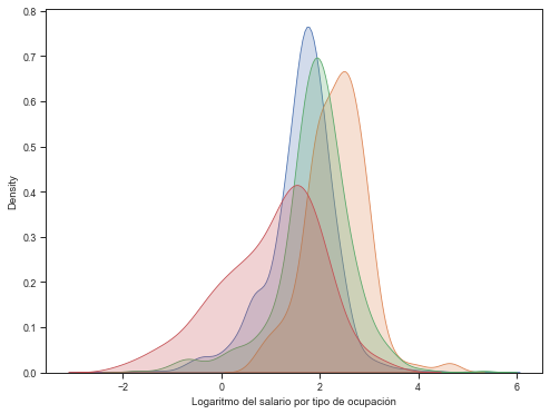
Labor occupations and real salary per hour densities#
A For loop is used to include in the same graph the density function of hourly wages for different occupations.
fig, ax = plt.subplots(figsize=(8,6))
sector = [ 'Ocupaciones elementales', 'Profesionales y fuerzas armadas', 'Operadores de planta y maquinaria',
          'Trabajo en actividades agrícolas, selvicultura y pesca']
nombre = [ 'Ocupaciones elementales', 'Profesionales', 'Planta y maquinaria','Actividades extractivas']

for a, b in zip(sector, nombre):
        sns.kdeplot(base4.l_salario[base4.labor==a], label=b, shade=True)

plt.xlabel('Logaritmo del salario por tipo de ocupación')

# Two relevant findings: stochastic dominance of the salary of professionals and
# concentration in lower levels of salary in the non-active primary sector.
Text(0.5, 0, 'Logaritmo del salario por tipo de ocupación')
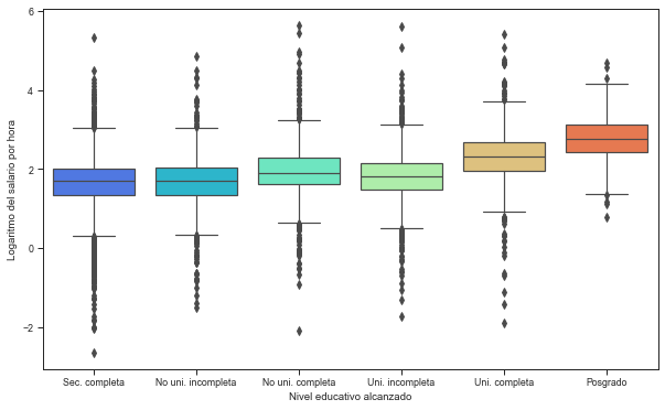
Box plot real salary and education#
fig, ax = plt.subplots(figsize=(10,6))

box = sns.boxplot(x="educ", y="l_salario", data=enaho[enaho['year'] == "2019" ] ,palette='rainbow')
plt.xlabel('Nivel educativo alcanzado')
plt.ylabel('Logaritmo del salario por hora')
(box.set_xticklabels(["Sec. completa", "No uni. incompleta", "No uni. completa", "Uni. incompleta", "Uni. completa", "Posgrado"]))\

# The real wage quartiles are increasing with the educational level.
# Lower salary dispersion for the postgraduate level.
[Text(0, 0, 'Sec. completa'),
 Text(1, 0, 'No uni. incompleta'),
 Text(2, 0, 'No uni. completa'),
 Text(3, 0, 'Uni. incompleta'),
 Text(4, 0, 'Uni. completa'),
 Text(5, 0, 'Posgrado')]
9.4. Relationships#
Charts used for both time series and cross-sectional data. These graphs allow to establish certain evidence of correlation or relationships between variables.
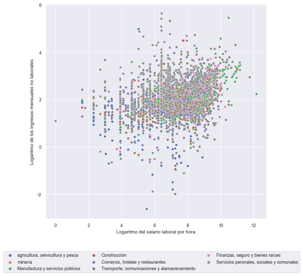
Scatter plot#
First, a random sample is drawn from the original database. Subsequently, a dispersion graph is presented between the hourly wage (logarithm) and the non-labor monthly income (logarithm).
#Full sample

sns.set('paper')
plt.figure(figsize=(8, 8))
plot = sns.scatterplot(data=base4, x="l_n_labor", y="l_salario", hue="sector", palette="deep")

plt.xlabel('Logaritmo del salario laboral por hora')
plt.ylabel('Logaritmo de los ingresos mensuales no laborales')

# By default legend inside plot. Following codes allow us to put outside.
# bbox_to_anchor: box location
# ncol: # columns of legend


plot.legend(loc='center left', bbox_to_anchor=(-0.2, -0.2), ncol=3);
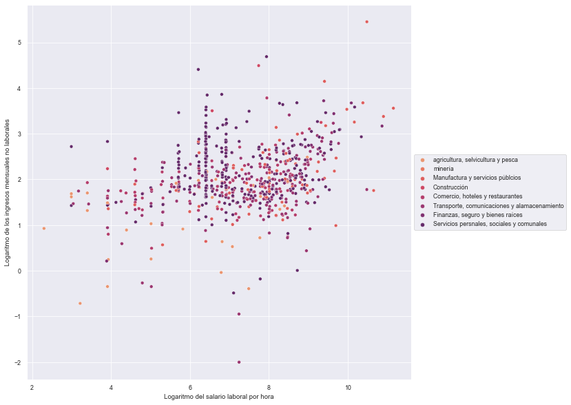
# Ramdon sample n = 3000

base5 = base4.sample(n = 3000)

sns.set('paper')
plt.figure(figsize=(10, 10))
plot = sns.scatterplot(data=base5, x="l_n_labor", y="l_salario", hue="sector", palette="flare")

plt.xlabel('Logaritmo del salario laboral por hora')
plt.ylabel('Logaritmo de los ingresos mensuales no laborales')

plot.legend(loc='center left', bbox_to_anchor=(1, 0.5), ncol=1);
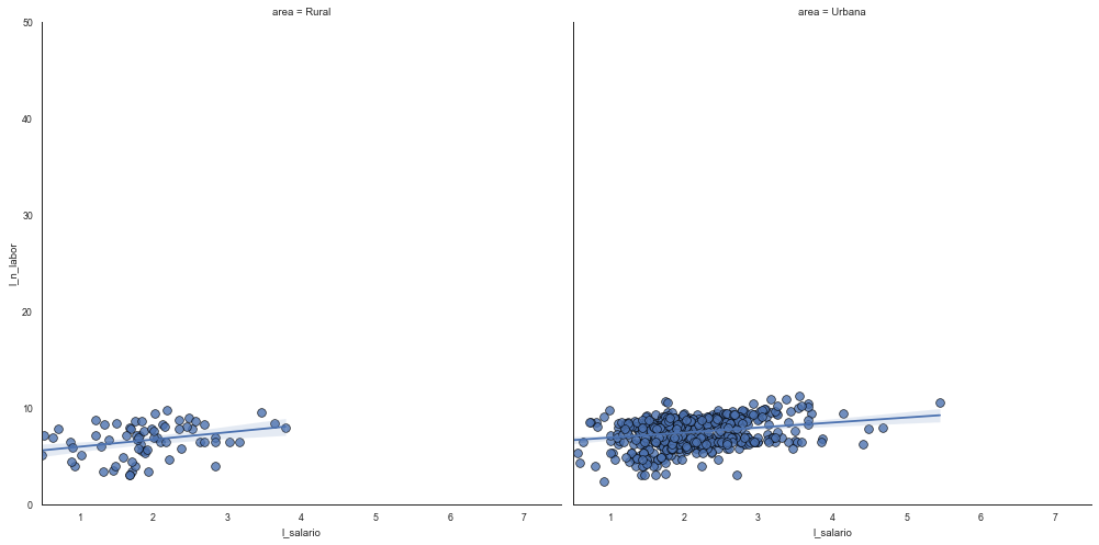
Reggresion real salary per hour and non-labor income by strata#
s = The marker size in points**2.
linewidths = “The linewidth of the marker edges.”
sns.set_style("white")
gridobj = sns.lmplot(x="l_salario", y="l_n_labor",
                     data=base5,
                     height=7,
                     robust=True,
                     palette='Set1',
                     col="area",
                     scatter_kws=dict(s=60, linewidths=0.7, edgecolors='black'))

gridobj.set(xlim=(0.5, 7.5), ylim=(0, 50))
plt.show()
Macroeconomics#
IMP: log-Commodity price index
TC: log-exchange rate
RIN: log-international reserves
IPC: log-price consumption index
RATE: central bank rate reference
D: Annual difference
macro = pd.read_csv(r"../_data/macroeconomia.csv")
macro['YEAR']  = pd.to_datetime(macro['Fecha'])
macro
| Fecha | IPM | TC | RIN | IPC | RATE | DIPM | DTC | DRIN | DIPC | YEAR | |
|---|---|---|---|---|---|---|---|---|---|---|---|
| 0 | 2003-1 | 2.83506 | 1.25634 | 9.18519 | 4.41828 | 3.7500 | 13.73166 | 0.83108 | 12.50532 | 2.25690 | 2003-01-01 |
| 1 | 2003-2 | 2.85371 | 1.25004 | 9.21777 | 4.42295 | 3.8000 | 12.48664 | 0.16400 | 13.17984 | 2.76396 | 2003-02-01 |
| 2 | 2003-3 | 2.84717 | 1.24993 | 9.24303 | 4.43407 | 3.8200 | 7.76170 | 0.65330 | 17.18115 | 3.33857 | 2003-03-01 |
| 3 | 2003-4 | 2.80982 | 1.24554 | 9.24188 | 4.43356 | 3.8400 | 1.97256 | 0.69980 | 13.92729 | 2.56103 | 2003-04-01 |
| 4 | 2003-5 | 2.88617 | 1.24686 | 9.23065 | 4.43324 | 3.7800 | 6.81493 | 0.92160 | 12.37214 | 2.39028 | 2003-05-01 |
| ... | ... | ... | ... | ... | ... | ... | ... | ... | ... | ... | ... |
| 199 | 2019-8 | 3.74485 | 1.22252 | 11.12236 | 4.88368 | 2.5642 | 3.71183 | 2.73013 | 12.37958 | 2.01920 | 2019-08-01 |
| 200 | 2019-9 | 3.74443 | 1.20844 | 11.12124 | 4.88375 | 2.5038 | 7.63091 | 1.29986 | 15.82517 | 1.83408 | 2019-09-01 |
| 201 | 2019-10 | 3.70510 | 1.20622 | 11.13029 | 4.88486 | 2.5045 | 0.48716 | 0.71850 | 15.12033 | 1.86310 | 2019-10-01 |
| 202 | 2019-11 | 3.69955 | 1.20500 | 11.11988 | 4.88594 | 2.2984 | 0.97267 | -0.08858 | 11.80591 | 1.84959 | 2019-11-01 |
| 203 | 2019-12 | 3.73001 | 1.20204 | 11.13212 | 4.88809 | 2.2501 | 2.87310 | -0.25863 | 12.80208 | 1.88227 | 2019-12-01 |
204 rows × 11 columns
sns.set('notebook')
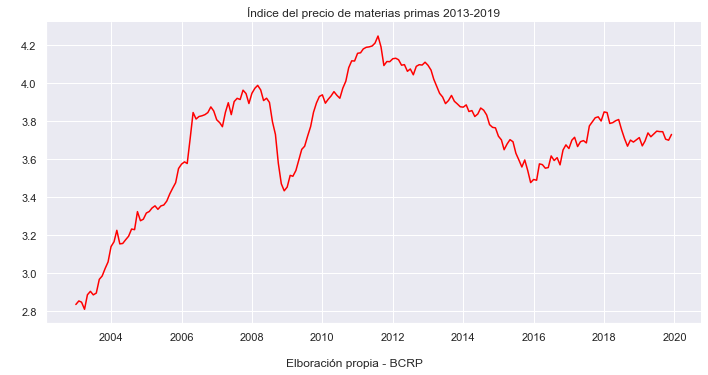
sns.relplot(x="YEAR", y="IPM", kind="line", color="red", data=macro, height=5, aspect=2)
plt.xlabel(' ')
plt.ylabel(' ')
plt.title('Índice del precio de materias primas 2013-2019')
txt="Elboración propia - BCRP"
plt.figtext(0.5, 0.01, txt, wrap=True, horizontalalignment='center', fontsize=12);
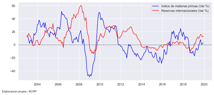
Series in a single image#
This graph shows a positive relationship between the change in international reserves and the commodity index.
sns.set('notebook')


fig, ax = plt.subplots(figsize=(12,5))

x = macro['YEAR']
y1 = macro['DIPM']
y2 = macro['DRIN']

plt.plot(x, y1, label ='Indice de materias primas (Var %)', color='blue')
plt.plot(x, y2, label ='Reservas internacionales (Var %)', color='red')
plt.axhline(y=0, color='black', linestyle='--', lw=0.8)

plt.legend(loc='upper right')

txt="Elaboración propia - BCRP"
plt.figtext(0.2, 0.01, txt, wrap=True, horizontalalignment='right', fontsize=10);
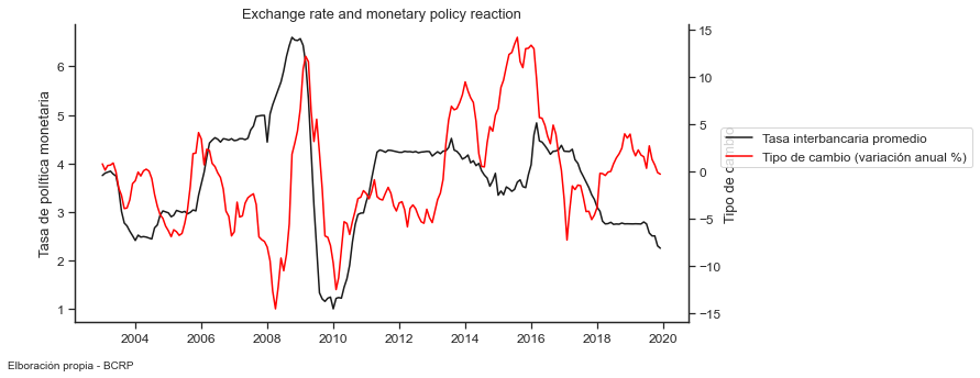
Dual-line Plots#
Exchange rate and monetary policy reaction#
sns.set('notebook', style = "ticks", font_scale= 1.08)

fig, ax = plt.subplots(figsize=(10,5))
lineplot = sns.lineplot(x= "YEAR" , y= "RATE", data=macro,
                        label = 'Tasa interbancaria promedio ', color="k", legend=False)

#sns.despine()
plt.ylabel('Tasa de política monetaria')
plt.xlabel(' ')
plt.title('Exchange rate and monetary policy reaction');

ax2 = ax.twinx()
lineplot2 = sns.lineplot(x= "YEAR", y= "DTC", data=macro, ax=ax2, color = "red",
                         label ='Tipo de cambio (variación anual %)', legend=False)
sns.despine(right=False)
plt.ylabel('Tipo de cambio')
ax.figure.legend(loc='lower center', bbox_to_anchor=(1.1, 0.5), ncol=1);


txt="Elboración propia - BCRP"
plt.figtext(0.2, 0.01, txt, wrap=True, horizontalalignment='right', fontsize=10);
9.5 Reference:#
Library of plots:
https://www.python-graph-gallery.com/stacked-and-percent-stacked-barplot
Seaborn package: